当flex遇到white-space:nowrap,你知道怎么破局吗?切图带你分析原理,三个方案任意选择!
写在最前:当flex遇到white-space:nowrap,你知道怎么破局吗?切图带你分析原理,三个方案任意选择!
# 一、场景:

# 二、简化场景:
# 三、页面布局:
<ul class="g-list">
<li class="g-list-item">
<div class="item-content-wrap">
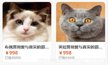
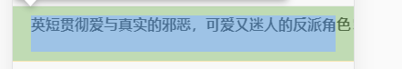
<div class="item-title"> 英短贯彻爱与真实的邪恶,可爱又迷人的反派角色!</div>
</div>
</li>
</ul>
2
3
4
5
6
7
# 四、问题样式:
.g-list-item {
    position: relative;
    display: flex;
    padding: 0.5rem 1rem;
    border-bottom: 1px solid #eee;
}
.item-content-wrap {
    display: flex;
    flex: 1;
    flex-direction: column;
    justify-content: space-between;
}
.item-content-wrap  .item-title {
    overflow: hidden;
    text-overflow: ellipsis;
    white-space: nowrap;
}
2
3
4
5
6
7
8
9
10
11
12
13
14
15
16
17
# 五、解决方法:
# 方案1:
①原理:
flex 属性是 flex-grow , flex-shrink 和 flex-basis 的简写,默认值为 0 1 auto 。后两个属性可选,
该属性有两个快捷值:auto (1 1 auto) 和 none (0 0 auto)。
.item {
  flex: none | [ <'flex-grow'> <'flex-shrink'>? || <'flex-basis'> ]
}
flex-grow 属性定义项目的 放大(拉伸) 比例,默认为0,即如果存在剩余空间,也不放大。
flex-shrink 属性定义了项目的 缩小(压缩) 比例,默认为1,即如果空间不足,该项目将缩小。
flex-basis 属性定义了在分配多余空间之前,项目占据的主轴空间(main size)。浏览器根据这个属性,计算主轴是否有多余空间。它的默认值为auto,即项目的本来大小。
当我们设置white-space:nowrap,项目控件由于不能计算多余的空间导致无法收缩了。此时我们设置固定尺寸就可以收缩了
②代码:
.g-list .item-content-wrap {
    flex: 1;
    display: flex;
    flex-direction: column;
    justify-content: space-between;
 +  min-width: 0;
}
2
3
4
5
6
7
.g-list .item-content-wrap {
    flex: 1;
    display: flex;
    flex-direction: column;
    justify-content: space-between;
 +  overflow:hidden;
}
2
3
4
5
6
7
给文字. item-title的父级设置宽度,通过 min-width、max-width、width属性都可以设置,但因为文字的长度不定设置width或者max-width都有可能遮住有效区域,所以建议使用min-width: 0比较符合;除此之外通过overflow: hidden使得父元素变为BFC也能达到同样的效果
 min-width: 0;
 min-width: 300px;
 max-width: 300px;
 width: 300px;
 overflow: hidden;
2
3
4
5
# 方案2:
①原理: 其实导致这种情况发生的不是父级item-content-wrap的flex,而是爷级g-list-item的flex,如果我们布局是上下结构,可以去掉爷级的display: flex达到相应效果 ②代码:
.g-list-item {
    position: relative;
  — display: flex;
    padding: 0.5rem 1rem;
    border-bottom: 1px solid #eee;
}
2
3
4
5
6
# 方案3:
①原理:
利用样式达到超出一行显示省略号不仅仅是使用 white-space:nowrap 属性,我们还可以使用以下属性来达到效果,而且通过 -webkit-line-clamp可以来设计几行才出现省略号的情况。但由于存在兼容问题建议移动端使用
  overflow: hidden;
  display: -webkit-box;
  -webkit-line-clamp: 1;
  -webkit-box-orient: vertical;
2
3
4
②代码:
.item-content-wrap  .item-title {
    overflow: hidden;
 —  text-overflow: ellipsis;
 —  white-space: nowrap;
 +  display: -webkit-box;
 +  -webkit-line-clamp: 1;
 +  -webkit-box-orient: vertical;
}
2
3
4
5
6
7
8
尊重原创,如需转载请注明出处!